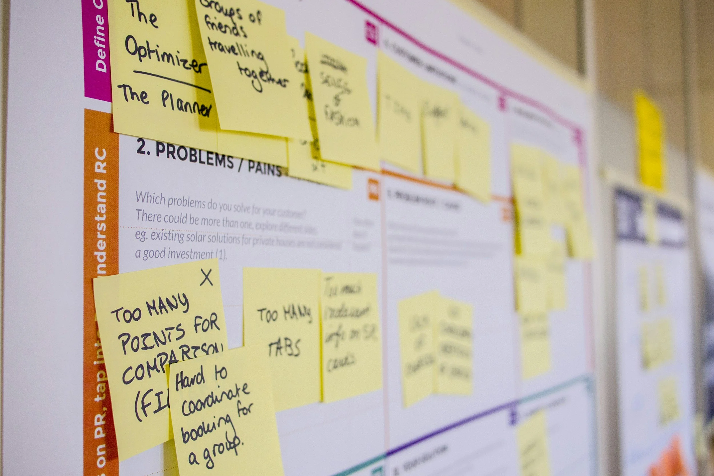
How I Map User Pain Points Without Jumping to Solutions
As someone who came to design from a sociology background, I'm wired to look for patterns in behavior. But in UX, it's tempting to start solving problems the moment you hear them. I've learned to pause and map the pain points before I try to fix them.
In my process, I use FigJam to cluster user quotes, observations, and frustrations into themes. I call this my "noise sorting" phase, it’s messy, but it helps me understand what’s really going on beneath the surface. For example, in the Spotify "Recognize Music" case study, users often said they forgot to save songs. But the real issue wasn’t forgetfulness, it was that the flow didn’t prompt them at the right moment. That only became clear after mapping out their journey.
This method helps me design with empathy and intent. Instead of reacting to noise, I try to listen through it.
By visually mapping what users say and do, I avoid rushing to assumptions. It becomes easier to identify not just what isn't working, but why it's not working. It’s a small shift in mindset that can lead to much smarter, user-centered solutions.
Even though I haven’t worked in a formal design team yet, I’ve found that clearly mapping user pain points helps me organize my thoughts and communicate ideas more effectively. It’s a way to bring structure to messy insights, and that clarity is something I imagine would also help when working with others in the future.

